Hills and valleys
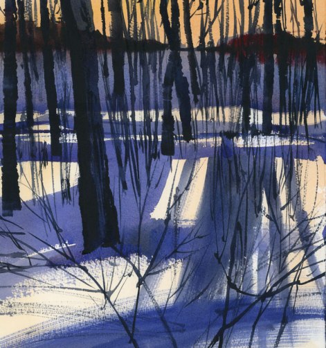
Posted: February 19, 2015 Filed under: Uncategorized 43 CommentsI rarely use rough paper but thought I’d give it a try today. I usually find it too bumpy, but the trick, as I found out, is to use really wet washes. I generally don’t seem to mix up enough paint on the palette and end up having a brush that goes dry before it should. With this little experiment, I made sure I had big puddles of wash on the palette for the first wash of orange sky and then later for the large blue areas. And the advantage of this is that when you do want some texture, you can let that big brush go dry and run it over the hills and valleys in the paper.













WOW!!!!!!!
LikeLike
I guess you like this one Harriet. thanks.
LikeLike
Very nice! I love it that you are not afraid to experiment with a variety of materials, subject matter, techniques and share. Thank you!
LikeLike
Thanks Sue. I do love trying new things. Of course there are many duds in the pile that I never post but that’s how you learn, right?
LikeLike
I like this Shari.. getting abstract just shape and color.
LikeLike
Thanks Gail. Yes, it’s really fun to experiment with this kind of thing. I wanted to get away from the wishy-washy…
LikeLike
Love it, Shari. Very very effective. The intensity of the shadows, the light on the snow, the darks of the trees, and that sky….WOW. You’ve captured the time of day. Congrats!
LikeLike
Thanks so much Martha!
LikeLike
The orange sky is simply magic!
LikeLike
Thanks Isabel!
LikeLike
Very nice, Shari! Lovely colors and textures.
LikeLike
Thanks Julie!
LikeLiked by 1 person
It looks like it was worthwhile!
LikeLike
It was a good experiment and I have lots of rough paper so I’ll be using it again.
LikeLiked by 1 person
Beautiful and strong
LikeLike
Thanks Anyck.
LikeLike
Stunning!!!!!!!!!!!
Excellent play on the lights and shadows.
LikeLike
Thanks Andre!
LikeLike
Shari; I always go to your site for inspiration, and you never cease to amaze me. I also have wondered how you scan your work for your blog? I have a Canon MG8120 flatbed that is just okay for scanning, but I always seem to get a dirty look and need to touch up my sketches in PhotoShop before I post them. Do have a trick to getting clean scans? Do you photograph your work rather than scan it?
LikeLike
Jeanne, I have an Epson Perfection Scanner. I use that all the time, except for very large paintings. The work always has to be touched up in Photoshop. The untouched scans are very flat so usually the levels have to be brought up in Photoshop. Also, sometimes one colour or another will be oversaturated and so I take Saturation down a notch. And the third thing is usually to make sure the whites are really white. That’s about all I do unless there are some splats I need to remove but usually I leave most of those.
LikeLike
Gorgeous, Shari! You really caught the feeling of the space.
LikeLike
Thanks so much Bev!
LikeLike
You have a way with trees and twigs that escapes my hand. Mine are too delicate and tentative while yours are positive and have impact. I really like this post – inspiration for me to keep trying until it clicks :: lynn
LikeLike
I love painting trees and twigs. I have one brush that I love for painting branches — it’s the Scroggy from Cheap Joes.
LikeLike
This is just so WOW! I love the powerful contrasts you have created with a limited palette. You work always seems to go beyond a simple picture and also captures the mood of the subject. Bravo!!
LikeLike
Well, I’m glad to hear that. Mood was what I was going for here. These are the woods near my house where I walk my dog and often the end of day light is very beautiful through the trees.
LikeLike
Very successful. I love your choice of colour and delivery. Your scene is so real (as familiar as a nice walk near a woods) and almost abstract at the same time. So well done.
LikeLike
Thanks so much Chris. This little patch of woods is a minute from my house and it’s always beautiful to spend a few minutes there with my dog and look at the changing light. I often freeze my hands trying to take pictures.
LikeLike
This is very graphic. Has the feel of a wood block print to me. So much strength.
LikeLike
Thanks Lee. I think you’re right about the woodblock. I guess it’s those really dark trees.
LikeLike
Love this! The sky, the shadows on the snow…. How do you get your trees so dark?? I’m thinking you mix your blacks….I can’t seem to get mine to look like that.
You always do such beautiful paintings…..thanks for sharing.
LikeLike
Thanks Nell. For the darks, I used Indigo. I love that deep blue which I sometimes mix with Alizarin Crimson or Burnt Sienna.
LikeLike
Crazy good! When I finally grow up I want to be just like you, but not as cute! Jacques
LikeLike
Jacques, you are very funny. I’m still waiting for you to come up here to do some snow sketching with me.
LikeLike
Insanely stunning. At first I thought it was a serigraph. I think you are creating new approaches to watercolors – a brave path to tread, but I think you must. The understated detail forces the mind to subliminally add what the mind and imagination want. Enjoy the weekend, Shari.
LikeLike
George, it’s a really great exercise to see how far watercolour can be pushed. We always think of it as mostly soft and transparent but it can be deep and opaque too. I like trying to see how far it can go, even if some sheets end up in the garbage.
LikeLike
This is wonderful Shari, so strong. A very successful experiment!
LikeLike
Thanks Anna!
LikeLike
Fyi
LikeLike
Beautiful!! Love the colors!
LikeLike
Thanks so much.
LikeLike
Perfect execution! Thank you for the advice using rough paper! You can be sure with me that you always have one student listening, at the minimum!
LikeLike
I’m so glad that there is one student listening, at least.
LikeLike