Water line
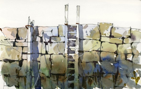
Posted: June 29, 2015 Filed under: Uncategorized 22 CommentsHow much can you achieve with one wash of colour? In this ink and wash sketch, I wanted to convey the image of the pole, ladder and granite blocks that are pale at the top but dark and moss-covered at the bottom where the tide waters go up and down each day. I started with an ink drawing and then painted with a wash that was quite light at the top. As I painted downward I kept adding paint into the lower wet area— blue, green and rust all combined to give that mossy effect. When that initial wash dried, I painted the cast shadows and a bit more texture on the upper rocks. The little darks between the rocks were the final step. I suppose I could have painted it rock by rock but I wanted it to look like my sheet had been dipped in dark water — more like the pole and the ladder had been— and this seemed like more of an effective way to do it. Sketched in a Travelogue Watercolor Journal, 5″ x 8″.










Shari, this DOES look like you dipped your paper into a wash! Good work 🙂 Also, wanting to thank you for your Craftsy class…it is AWESOME and I have already watched it through a few times! Would love to see more…
LikeLike
I’m so glad you like the class! I hope you upload something for me to see. It’s really been interesting to see the projects that people are posting.
LikeLike
FABULOUS!!!! Thanks so much! I will try it.
LikeLike
Go for it Suzanne!
LikeLike
I love it. I am working to try to simplify my overly busy work and this is such a great example of keeping it simple yet getting precisely what you want to say done without overwhelming the painting. Thanks for the inspiration.
LikeLike
I’m glad you found it useful Nessa. Sometimes it’s the simple subjects that teach us the most.
LikeLike
I often skecth near the sea when I am in Brittany (France) and add a watercolour wash so your painting and explanations are just great ! Thank you !!
LikeLike
Thanks for writing Martine!
LikeLike
Always lovely work and great explanations of your methods.
LikeLike
Thanks Lee!
LikeLike
This is simple and gorgeous at the same time Shari — nice work -)))
LikeLike
Thanks Jane!
LikeLiked by 1 person
I have been following your blog for a long time and am a big fan of your work . I love your style, and have always wondered how your colours are so fresh . I would have loved to attend your workshops but living half way around the world in Bangalore, India , I didn’t think I would ever get a chance to do that . So I was thrilled when you announced your online class and enrolled immediately! It’s very well presented and now I understand how you get that fresh, clean paintings , thank you so much 🙂 I have no formal training in art andlook forward to learning good techniques from such workshops. hope to see more such classes from you soon
Prithi
LikeLike
Thanks so much for writing Prithi. I’m so glad you like the class!
LikeLike
Extremely successful! And very instructive.
LikeLike
Thanks Alison!
LikeLike
We met in Denver and I continue to enjoy your blog. What kind of ink pins do you use?
Dennis Pendleton
LikeLike
HI Dennis. I hope all is well with you! I often use a Platinum Carbon Desk pen with Platinum Carbon ink. That is my favourite pen.
LikeLike
I really like this… the graded wash works really well. I like the simple composition with so few elements. And I particularly like the elevational treatment.
I think I used the word “elevational” previously and you seemed confused by it… that may be because I found that, when I referred to my dictionary, it is not actually a word… sometimes the English language is so limiting! Anyway, it should be a word… an adjective deriving from the word “elevation” which for an architect means “a drawing or design which represents an object or structure as being projected geometrically on a vertical plane which is parallel to its chief dimension”. There… I am sure that is clear for you now?
LikeLike
Glad you like my elevational sketch Ross. And thanks for the clarification.
LikeLike
This is beautiful, playing on the border of reality and abstraction, and also of line, light, and color.
LikeLike
Thanks for writing Julana.
LikeLike