Good news and bad painting
Posted: September 21, 2015 Filed under: Uncategorized 38 CommentsLet’s start with the good news. My painting “Breakwater” was selected for 90th Annual Open Juried Exhibition of the Canadian Society of Painters in Watercolour at the Halifax Public Archives Exhibition Room, Halifax, Nova Scotia. (Exhibition date: Nov 4, – Nov. 28, 2015). This was painted on location in Gloucester in June and if you want to read a little bit about the process you can here.
And now for the bad painting. Yesterday I received this comment on my blog from Francisco about my post from Saturday, “would love to see a batch of the “disasters”, might qualm the feelings of inadequacy that arise when viewing your work.” He was responding to a comment that I had made about painting without pencil lines,”When I paint this kind of sketch with no pencil lines, it always starts out easy. You make one nice brush stroke (in this case, the geranium bud at the top) and then you move downward. At a certain point you realize that it is getting more complex and there is no plan for where to go next. It is a bit like a flow chart. One arrow points to success and one leads to disaster. More often than not the outcome is the latter, but occasionally it turns out ok.”
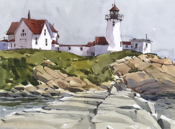
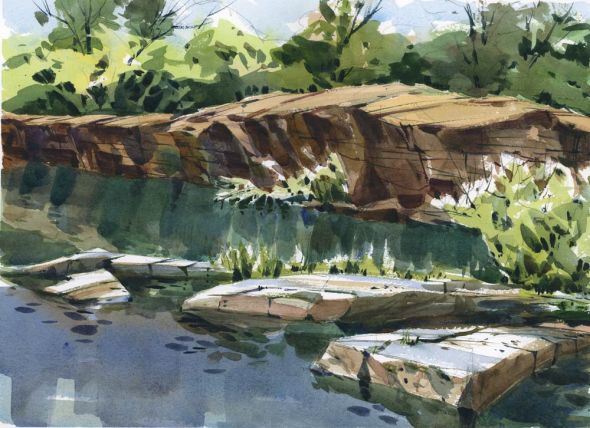
I’m up to Francisco’s challenge. I can’t seem to find any disasters (in the disaster pile) that occurred because of lack of pencil lines but I do have this little dud that I painted on the same trip to Rockport as my lighthouse above. I would probably qualify this one under the heading “lack of planning”. I can’t blame this on bad paper because this is done on Arches, nor on the weather, because it was a perfectly beautiful day. It was painted while on an outing with family (can’t blame them either) but in my haste to get this done and not keep them waiting, I didn’t take the few minutes necessary at the beginning to sketch out a value plan. The result is a weird optical illusion — the rear wall of rock seems to float above the foreground rocks. Probably a little work in Photoshop would help me figure this out, but I think what I did wrong was to bring the dark reflections of the rocks on the left too far down. And because I knew something was wrong, instead of leaving it alone and analysing it later, I did what I often do, which is to keep on adding paint. There are other design errors too. The shapes at the top seem to echo those at the bottom, almost like two paintings. And the foliage in the shadow of the rock wall is too light. Could this dud have been avoided with good planning? Probably. Will I make the same mistake again? Sadly, yes. But it’s a good exercise to spend time analysing what went wrong and trying to avoid it next time. Thanks Francisco.













We didn’t mean to make you feel rushed! On the bright side, you were able to produce something for the challenge.
Olivia showed your paintings/sketches of Cambodia to Jesse and he loves them!
LikeLike
You didn’t make me feel rushed! It was me putting pressure on myself. Or maybe it was time for lunch! I’m glad Jesse likes the sketches!
LikeLike
Thank you, it’s extremely valuable for you to show your less-than-perfects to us. When you analyze your mistakes it is much more like you are analyzing what goes wrong for me as well. I gain a lot of knowledge from it.
LikeLike
So agree with you. I find even on my little blog, I get tons of feedback from any posting where I discuss my failures (and Shari’s are no where near as bad as mine, I’m a newbie to watercolor!)
LikeLike
I’m glad it was useful for you too Katie. Thanks.
LikeLike
I’m so glad this was helpful Peggy for you too Peggy. Thanks for letting me know.
LikeLike
Just here to whisper..
I went to the new Hachem in Vaudreuil~Dorion..
I loved it.
Maybe… you would too.
It will be my new..on my own..browsing place.
LikeLike
I didn’t know there was a Hachem store in Vaudreuil. Don’t tell me this. Now I will have to go there and spend money…
LikeLike
I am telling you..opened this past Sat.
I went Monday.
To me..it is fantastical.
LikeLike
Oh, you’re right… that sketch is so so bad! I don’t know how you live with yourself some times when you produce work like that… perhaps you should take up knitting? : )
Anyway, I can help you out here… why don’t you just bundle up that “disaster pile” and send them all to me… I would happily dispose of them for you. (BTW, with the one above, when you send it to me, I will cut it in half horizontally and make two panoramic sketches. I can’t understand why you didn’t think of that… perhaps you are more suited to knitting.)
LikeLike
Ok, it’s a deal. I will box up all the duds and send them to you. Who knows what else you will cut up. I have a feeling you might cut holes where all the cars are.
LikeLike
Oh I would never cut holes in your sketches! However, perhaps they may benefit from a little bit of sensitive cropping when cars are involved.
LikeLike
First off, Shari – Congratulations on having your painting selected – it’s a true beauty with a fantastic composition – such excellent perspective. As for your “failure – I wish I could say it was mine! I do appreciate your analysis and I’m working to learn from what you said here but I also must say, I love your colors and how you “carve” the shapes of rocks – do you use a flat brush for that? So much to learn, so little time. Thank you again for posting both beauty and lessons.
LikeLike
Thanks for the nice wishes Mary. I really appreciate it.
If I remember correctly, I painted the rocks with a round brush but I do often use flats for rock shapes. It makes sense to use straight edges for straight objects but sometimes I go out with only round brushes.
LikeLike
My eye must be off because it still looks darn good to me! Maybe it’s a ‘magic eye’ thing, I was never very good at those. Congrats on the award too!
LikeLike
Thanks so much Bob.
LikeLike
congratulations! that’s really awesome. And thanks for sharing this. Still quite beautiful, the front rocks, the back reflections, stunning. I’m curious how the value sketch would have helped solve the reflection problem. Is it because you would have already solved it in the value sketch ? Your instinct may have been right to paint the reflections further down. If you flip the painting upside down, you will see it’s the area that is really working. The very front one is done rather carefully, but the ones right behind seem a tad lacklustre. But I can see how if you had continued them all like the shorter reflections, the illusion would have worked.
if you do get around to photoshopping it, I would love to see how you solve the optical issue. Maybe we can squeeze a “quick tip” on reflections out. Or maybe a 3 step guide to always getting reflections right. This could lead to the definitive article ; ” Watercolour Reflections: the only technique you’ll ever use again” And of course this will naturally lead to the workshops on the canal you’ll be doing next summer, teaching watercolour reflections in a classic location. Maybe even at the spot I met you this summer!
LikeLike
by the way, I would take that workshop!
LikeLike
Ok, so now I know who you are. You were at the St. Gabriel Locks when I painted with the Montreal Art Centre group, right?
I think the value sketch would have helped avoid the problems that I now see. For example, I may have seen that it looked like two paintings.
I still haven’t tried using Photoshop to solve it but if I do I will post it for sure.
And thanks for all the suggestions for articles, workshops, quick tips, etc. I will pass them along to Craftsy.com so they can create more online courses for me to film. Great ideas, all of them.
BTW, if you or any other artists from the Montreal Art Centre are interested, our Urban Sketchers Montreal has a sketch outing this Sunday. We meet at the Atwater Market at 10 am.
LikeLike
That was I. Where at the market ? I guess if you will be sketching it will be obvious, but just in case, thanks
LikeLike
We’ll meet at the south side of the market at 10am. If you arrive later we’ll be more spread out but we gather again for lunch around noon.
LikeLike
Thanks Shari, your analysis of the painting, reviewed and described for the reader, teaches me a lot! Not only do together, like when I see all your painting (I try them close harmony that you have expressed to learn to see with the eye that is able to see the interrelationships and knows how to put together communicating the beauty of the whole vision) but to see the details and the causes that have produced effects. Congratulations on your painting selected!
LikeLike
Imperfection, making unique the beauty, is an art!
LikeLike
Thanks so much Luisella!
LikeLike
Ha ha! Shari, I would love to have a “disaster” painting look this good! Not even on my best day…… But, I agree with you. The shadows of the rock wall, to the left, being too far down? If there was more of the sky reflected in that area, would it make a difference? It would be interesting to see how you “fixed” it. No matter what, I am so impressed with your technique with painting rocks and shadows.You sure know how to grab my attention!
LikeLike
Also, congratulations on your painting being selected for the exhibition! I remember commenting on how well I liked it. I still do!!
LikeLike
Thanks so much Linda. I will definitely post the painting if ever I get around to fixing it. I’m not really sure it’s fixable.
LikeLike
I’m not sure I understood everything… but anyway I will, YES: “ME” one day be able to do so nice aquarelles! That’s one of my challenges! 😉
Thank you Shari for sharing your work
LikeLike
Thank you Renata, for writing.
LikeLike
Thanks for sharing this Shari! It’s great to hear your analysis of work you think failed. It’s still crazy beautiful, but you’re right…there’s a weird optical illusion taking place. And honestly…I’m sort of loving it!! 😊Really fascinating! Even your mistakes have a magical quality about them!
LikeLike
You are too kind Charlie. I think there are areas that work on the painting, but the “whole” doesn’t work. Maybe I should cut it in two, like Ross suggests.
LikeLiked by 1 person
Okay…but when you do that, cut it in half first and send one half to Ross and the other half to me! 😉
LikeLike
I am not sure i understood your analysis of your “failure”. No matter, i love it!
LikeLike
That’s ok Denise. Thanks for writing anyway.
LikeLike
We all seem to be on the same page on this one, Shari.
Your “disasters” would be my “Masterpieces”.
If only I was a bad a watercolorist as you.
🙂
LikeLike
That’s very funny Tim. Thanks for writing.
LikeLike
Stunning work!
LikeLike
Thanks!
LikeLike