Experiment in blue
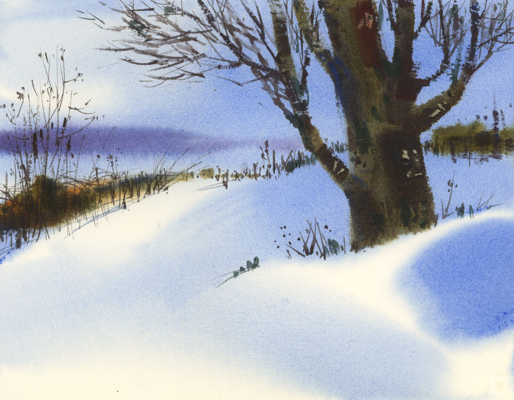
Posted: January 20, 2016 Filed under: Uncategorized 28 CommentsThis isn’t my usual way of painting, but I was in the mood to try something a little different today. I painted wet-in-wet on 300 lb Arches paper, which I don’t use very often, (and certainly not for experimentation), but I have some old stock that I wasn’t even sure was good anymore. I wanted to try some soft snow shadows, so I wet the paper completely (only one side is necessary with this thick paper), and then painted the sky and snow shadows with a big flat brush (2″) loaded with Verditer Blue. It’s an interesting blue that I think is a good substitute for Cobalt in winter scenes and I’ll definitely be trying it again.


Wow Shari! This looks awesome! You’re a great painter.
LikeLike
Thanks so much for writing Adeline.
LikeLike
Love this one
LikeLike
Glad to see someone use Veriter Blue! I use it lots since I am allergic to cobalt. Fun to see you doing wet in wet as well!
LikeLike
Veriter blue is new to me, which brand makes it? I love the colour very much. Thank you, I love to get your sketches.
LikeLike
Thanks Birte. That Verditer Blue is made by Daniel Smith. It’s a beautiful colour, isn’t it?
LikeLike
That blue just makes the snow glow.😊
LikeLike
Love this one!
LikeLike
Very interesting. What size paper and it looks like the rest was completed in various stages of dryness?
LikeLike
This one, to me, has an ethereal look. I would have loved to watch a video of you painting this as it was created. It’s beautiful and quiet. Thank you.
LikeLike
Maybe one of these days I will do a step-by-step post of this. Just need to find the time!
LikeLike
I love all your work. Nothing is the same. Your range is amazing.
LikeLike
this looks like a ton of fun, Shari! wet in wet means you won’t have to hang out in your car so long and freeze too!
LikeLike
This is gorgeous, Shari! Love the result and love that blue…adding it to my list of thugs to try. Hehe Thanks so much for sharing your process as well! 😃
LikeLike
It was 46 here this morning so this beautiful scene almost, but not quite, looked like my front yard. Jacques
LikeLike
You better believe you should try it again! Gorgeous!! Thank you Shari for brightening a winter day, both on the screen and off. 💛
LikeLike
Shari, I think it’s gorgeous!
LikeLike
Gorgeous winterscape!
LikeLike
Beautiful painting
I love the verditer blue. It has a kinder personality than the cobalt. I thought before reading, the hue is ultramarine blue. Nice surprise. Thank you
LikeLike
I love your description of Verditer Blue. A kinder personality is a wonderful way to describe it. Thanks for writing May.
LikeLike
Absolutely beautiful. I love the way you’ve capture the snow and the trees.
LikeLike
Awesome! Your painting definitely “sings the blues”. I checked the internet to see if that shade of blue is available in Acrylics and didn’t see any. You’ve inspired me to play with cobalt blue adding a tiny tad of another color to see if I can make it come close; however, I’m sure that it would be difficult to replicate because of the transparency of watercolors and the glow of the white paper underneath. Perhaps manganese blue may be close? I don’t have a tube of that color, but after seeing your painting, I might buy it.
LikeLike
This is outstanding Shari — I love it and we can feel a depth of snow with the wet on wet that is not really visible web on dry. Wow!
LikeLike
Beautiful.
LikeLike
Love the edges…
LikeLike
This is a lovely little painting. Just a little different from your usual style. That is a new blue to me. Love following your work as I am in eastern Ontario so not that far from you. Similar landscapes. All the best to you in 2016!
JB
LikeLike
Hi Janet,
Yes, a little different from the usual, but I always love to try new things. They don’t always work out but that’s how you learn, right? All the best to you in Ontario, and thanks for sending me a note. Much appreciated.
Shari
LikeLike
Loverly painting, edges are perfect. Verditer is a good paint for landscape IMO. Pigments are cobalt PB28, cerulean PB36 + white PW4. I think it’s the slight opacity that we enjoy because it plays off the usual transparency of watercolor.
LikeLike