That mysterious blue
Posted: March 5, 2016 Filed under: Uncategorized 33 CommentsA few weeks ago I painted a snow scene and many people emailed me inquiring about the blue pigment I used. I was testing some paints for an art store and until they became available, I couldn’t really say what they were. Well, they are stocked now in Montreal, so I can reveal that the paints I was testing were Holbein’s Irodori Antique Watercolours.
The first tests I did were with the greens, pinks and purples. Have a look at my little test sheet. You’ll see that the paint is very granular, the colours are intense and the paint is quite opaque, almost like gouache. If you read the product literature, you’ll see that the watercolours have been created from ancient Japanese and Chinese pigments.
The first test that I did was to paint some tulips. You can see that the paint is not quite like traditional transparent watercolour. The greens, pinks and purples are rich and so saturated, but they don’t move around quite as much as I am used to. This is pure pigment mixed with gum arabic, but there’s no ox gall in the mix to make the paint flow. Quite a joy for flower painting, but how would this work for plein air work?
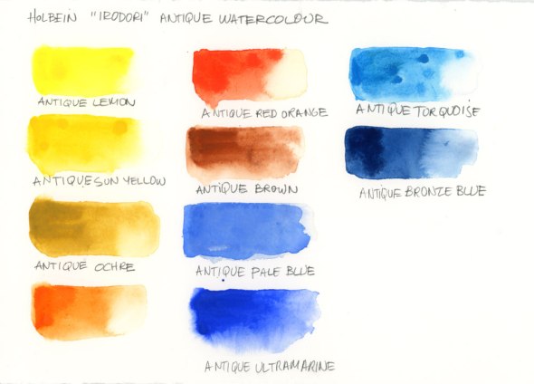
Since I didn’t quite have the right colours for urban sketching, I went back to the store to get some more samples of blues, yellows and reds. Here is the sample chart for the next tests.
That’s when I painted the snow scene using the Antique Pale Blue for my shadows. It’s quite a unique colour which is probably why so many people asked me what it was.
I think these pigments are at their best when used unmixed, in other words, the pure version of the paint. I couldn’t really test them for a plein air car sketch because I didn’t have enough paint to fill my palette, but I did paint a few wheelbarrow scenes from my window and I can’t say I liked the experience of mixing them. The colours became flat and dull (more like gouache), like in this backyard sketch.
Would I use these paints now that they are available in store? I certainly wouldn’t replace everything in my palette but I think that a few tubes would be a nice addition to what I already have. Each tube is the same price (unlike most watercolours which vary by series) and I did buy a tube of Antique Seedling because it will be wonderful for those light spring greens (when spring finally arrives!). And of course I bought the Antique Pale Blue for painting snow. If you enjoy painting florals, it would certainly be worth giving these a try, both for the colour intensity and the way they move around on the paper.


















Very interesting post, Shari! i continue to learn about painting and the colours i used originally are changing. I do like DS for their creaminess and translucently. Less is more ! I will be interested in seeing how this range develops in its use.
LikeLike
I’m glad you found it helpful. I love trying new products, but if you read further down in the comments, you’ll see that Jane Blundell added a little warning about the lightfastness rating of these paints. I will have to investigate this further.
LikeLike
Hi Shari
That was very interesting.
Now I want the scientific reason why these colours cannot mix well with one another. On the other hand, if a person was forced to only use one colour for a painting (as in old fashioned book illustration) I get quite excited by the way this pigment keeps it sparkle, freshness and oomph. Thanks so much for this. 🙂
LikeLike
Hi Chris, It could just be me who is having difficulty with mixing the paints. When I’m on location I mix a lot of red with blue or burnt sienna with blue. It’s possible that the reddish browns in this series are duller than I am used to so they create dull mixes. I think that if you put two colours together that are closer on the colour wheel, like the pinks and purples, you wouldn’t have a problem.
LikeLike
How fascinating! The Holbein Irodori range has been available here, Tasmania/Australia, for a very long time and I recently purchased their Sky blue (PB15, PW6) after admiring your March Panorama. I figured that would be close to the Van Gogh travel kit formula you mention in the 2 March post. So pleased I can now buy locally that gorgeous snow shadow blue. Not sure how best to use them with other watercolours – thanks for the tips.
Tassiedi
LikeLike
HI Tassiedi,
I will be trying these out as additional colours to my regular palette. We’ll see how that goes. When I go to South Carolina next week, I’ll bring along the seedling Green and see how that looks. I would suggest buying one tube to try out and see what you think. I think the purples are quite beautiful and rich as well. The Sky Blue is very beautiful too so let me know what you think of that.
Shari
LikeLike
Thanks for the info and the analysis Shari. I use mostly Holbein paints. I will probably try some of those intense lavenders as I find that most of the cool reds I have tried are very staining and just sink into the paper losing their intensity. Good info about the behaviour of pigments when Mixed.
Sent from my iPad
>
LikeLike
Garry, you use a lot of purple mixes in your work so you would probably love these. Try some out and let me know what you think.
LikeLike
What store are they in? Thanks for sharing the test results! Love the blue!
LikeLike
These are at Avenue des Arts on Victoria in Westmount.
LikeLiked by 1 person
This is great information!! Thanks so much for sharing Shari. I didn’t ask about that blue, but totally did wonder what it was. Such a great color… Definitely going to have to check that one out!
LikeLike
I’m glad you found it useful Charlie. I think these are good colours for sketches, but if you read Jane Blunder’s comments on the lightfastness, maybe these wouldn’t be great for work that intended for sale.
LikeLiked by 1 person
Yeah… It seems I like a lot of colors that fail that test. Luckily I’m only going sketchbook to digital right now, but I’ll have to change my palette if I plan to sell originals. (Sorry Opera Rose! Hehe)
LikeLike
I like reviews too:)
LikeLike
Thanks Monique!
LikeLike
At last, the mystery color is revealed . . . Yeah!! Thanks Shari. Good to know that these can be purchased in separate tubes AND are available in Canada! When you mentioned “ancient Japanese…colors”, it triggered my remembering information I’d just come across recently – perhaps not a new product – Kuretake Gansai Tambi Watercolors which are opaque and gouache-like and manufactured in Japan. Here’s a link to one of the reviews: http://jadmontenegro.tumblr.com/post/125485389889/watercolor-kuretake-gansai-tambi-review
LikeLike
Yes, the mystery colour is revealed Gayle. And thanks for the link. They seem quite similar but I will have to read more about them. The colours are quite nice as well and the packaging sure is beautiful.
LikeLike
The antique turquoise (Pthalo Cyan PB17) is actually quite mixable and fairly transparent, at least in my own use of it. (I use it over ink drawings and have never seen it cloud the black lines—much less opaque than cobalts and cadmiums.) It’s as close a match as I’ve ever seen to my beloved, long-departed Manganese blue. Looking at my sketches with it, I think the pigment isn’t ground quite as fine as Pthalo normally is, but I find this actually makes it easier to handle. Pthalo’s (PB15:3) usual tinting strength is so strong that I often avoid it. I have not tried any of the other Antique watercolors, so I cannot speak to how those intermix. But Pthalo Cyan mixes beautifully with regular watercolors, creating beautiful greens with a wide range of yellows and oranges.
LikeLike
Thanks for this info Urbanspinner. I’ve been looking for the pigment compounds but so far have only found them on the tubes that I purchased. Have you seen this anywhere online?
As for the mixing properties, I can see where I had difficulty. I was mixing browns and blues and ended up with very dull greys. I could see that using the Phthalo with yellow could be quite nice so I will test these out some more. It might be nice to use a Phthalo that doesn’t overpower everything.
LikeLike
I actually found this paint through the Handprint web site, when I was researching cool blues that might function like Manganese. The Dick Blick web site has the pigment information for the whole Antique line from Holbein. There is also the very complete Color of Art Pigment Database (http://www.artiscreation.com/Color_index_names.html) that I use regularly, because Handprint’s info is sadly starting to age a bit. But it is sorted by pigment number, not by manufacturer product line.
LikeLike
It’s always fun to test new paints 🙂
Interestingly, Daniel Smith paints only contain gum arabic – no other binders. Some have gum arabic, ox gall and glycerine or honey.
I’d be checking the pigment numbers and doing a bit of research on the lightfastness of these new paints though – many of the traditional Chinese and Japanese colours I have tried have failed my lightfast tests, and paintings I have done using traditional Chinese pigments in the past have faded badly.While it’s not a problem in a sketchbook, for exhibition or sale it can be a real issue.
LikeLike
I agree Jane. That is something to watch out for if anyone uses this paint for exhibition work. They do have a permanency rating on their site but no pigment numbers. I’d be curious to hear what you think of that permanency rating. It seems that the reds and yellows are less reliable than the rest.
LikeLike
Honestly, I would be astonished if the Daniel Smith paints contained no humectant (like glycerine, honey, propylene glycol, or some other sugar-type substance.) In the history of watercolor paints, the big breakthrough came in the 19th century, when colormen realized the cakes would not need to be ground with water before use if a humectant was added to the paint in addition to the pigment and gum arabic binder. The humectant allowed the cakes to rewet easily simply with the touch of a wet brush. If you have ever made your own watercolor paints, you will quickly see that some sort of humectant is essential to making the paint usable in pans. The Daniel Smith paints are drier than many in the pan, but they still rewet far more easily than the paints I have made with no humectant at all. (Btw, Ox gall is a wetting agent, which is generally needed for the manufacture of paint. Some pigments are extremely resistant to being mixed into water, and wetting agents are key to getting them ready for milling.)
LikeLike
I asked directly when I was at the factory in Seattle, and was told that they only use gum arabic. No other binders. That’s all that is listed on their paints too so a special sort of gum arabic? I was curious since they do dry nicely in the palette yet rewet so well.
LikeLike
Thanks Shari for sharing, I also wanted to know what that blue was, and will go check on these paint.
Always fun to read you,
Louise
LikeLike
Thanks so much Louise!
LikeLike
Quite interesting. Have you tried lifting the paint? Curious to how permanent it is.
LikeLike
I haven’t tried lifting the paint Mike, but I have read some online forums and it seems to be quite easy to lift. Apparently it’s not good paint to leave on a palette because it doesn’t rewet well, so you should only squeeze out what you need for one painting session.
LikeLiked by 1 person
The reason they don’t mix that well is because Holbein doesn’t use Ox gall which tends to make the paints act in a more traditional manner. Also the names may be antique but the pigments are mostly moderne….quinacridones, phthalocyanine. I also noticed they used pr83 alizarin…oh oh! Dick Blicks site has all the pigment info for this paint line.
Love your blog!
DougN
LikeLike
Hi Doug, Thanks for the info. I will certainly look at the Dick Blick site to see the info. For now, I will probably just use these paints in sketches and not in paintings intended for sale. That would probably be safest until I know more. Glad you like the blog!
LikeLike
Bonjour,
Concernant les couleurs Iridori, je vais apporter ma modeste connaissance à la vôtre. Je suis imprimeure de métier, principalement en taille-douce et en gravure sur bois. Je suis aussi artiste, et historienne de l’art, j’aime le dessin, voici la raison pour laquelle votre groupe m’intéresse. En 1995 et 1997, je suis allée travailler au Japon en tant qu’imprimeure pour le Mokuhanga (gravure japonaise). Les couleurs Holbein (fabriquées au Japon) sont souvent utilisées pour l’impression des gravures sur bois, selon la tradition et se substituent au préparations de pigment et de colle de riz. Plusieurs imprimeurs ont comme principale occupation de reproduire les oeuvres de Hiroshige, Hokusaï, etc., des artistes graveurs du 19 ème siècle. Les couleurs Iridori, furent crées par Holbein pour répondre à cette demande de l’usage d’une palette de couleurs corespondant à cette période. Il s’agit d’avantage de gouache, plutôt que d’aquarelle traditionnelle, ceci explique les raisons de l’opacité des couleurs.
LikeLike
Bonjour Danielle. Thanks so much for writing. Sorry it has taken me so long to respond.
I loved reading your insight into this paint and about your background as well. It makes a lot of sense when you explain about the colours. How fortunate for you to have this opportunity to work in Japan. That gives me a much better understanding of the paint, and why it is so opaque. Even though it is labelled as watercolour, it is basically gouache, correct? I will certainly keep all this in mind when I paint with it.
Regards,
Shari
LikeLike
Au plaisir Shari ! Oui, on peut davantage qualifier les couleurs Iridori Holbein de gouaches, car elles sont plus opaques. Holbein a d’ailleurs une gamme de couleurs « watercolor », mais pas en Iridori…
LikeLike