Orange, yellow and blue
Posted: October 23, 2018 Filed under: Uncategorized 31 CommentsWhat do you do when the thing you like drawing least (in my case it’s cars) is front and centre in your scene? There are two choices available to you: move where you are or stay and deal with it the best you can.
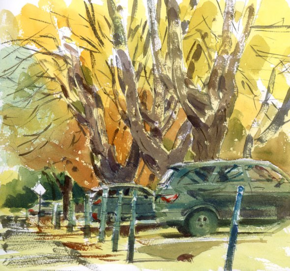
Today on my way to school, I had this very situation. I parked on a street near my house with a beautiful row of maples, but blocking their trunks were two cars. With only an hour to sketch, moving was not option. That would have used up all my precious sketching time. Instead I decided to try to find a way to unobtrusively integrate the cars into my sketch. I wasn’t quite sure how to best combine both the gentle shapes and flowing lines of the trees with the shiny, reflective, angular cars, and in the end decided that judicious use of colour would be my best option.
Instead of dipping into the full range of colours on my palette including dark blues and greys for the cars, I chose a limited range of pigments: Naples Yellow, Translucent Orange, Cerulean Blue and Cobalt Blue. I’m always surprised by how harmonious the mixes will be when you only use a few pigments. And I think that because it’s very hard to get deep darks with any of these colours, I avoided making the cars overly obvious. Also please note something new in the suburban landscape this week: the vertical driveway markers put up by the snow clearing companies. A sure sign of changing weather.











The two cars add reality to the city scene. The trees are dominant and colors are perfection.
LikeLike
Ghislaine, how nice to hear from you. I hope you are still enjoying your Montreal snow scene.
LikeLike
Nice job of planning and execution! It hardly looks like much of a challenge to you for you managed a good composition and strong colors of the season. Thanks for sharing.
LikeLike
Thanks so much Bernadette. It really has been a vivid autumn in Montreal.
LikeLike
The result is a beautiful combination of artistic and realistic.
LikeLike
Thanks so much Sadje.
LikeLiked by 1 person
You are welcome.
LikeLike
Talk about great timing – just which colors to replace & those were on the test pad – did a quick scenario with them & have a whole new combo that’s fresh fun for awhile
Thank you !!! As always
LikeLike
Soni, I’m so glad to hear that. It makes my day to find out you could use an idea or two from the posts.
LikeLike
Well done! Thank you for sharing as I avoid cars like the plague. Now I see why mine look odd…they’re too obvious!
LikeLike
You could just leave them out…I know you have one of those artists licences.. hahaha
LikeLike
I do have that license but I forgot it at home in my other sketching bag : )
LikeLike
Genius!
LikeLike
No, just another day, another solution to a sketching problem.
LikeLike
You did this beautifully! I do like the car colors, too.
LikeLike
Thanks Lois.
LikeLike
I have the same issue when I take photos, but it’s have to Photoshop them.
The beauty of the trees isn’t lost behind the trees. They still look very majestic.
LikeLiked by 1 person
You are a true urban sketcher after my own heart. ❤
– Tina
LikeLike
Tina, I have a feeling you like drawing cars more than I do. Just look at your sketching name.
LikeLike
Interesting problem solving and great result!
LikeLike
Thanks Marina.
LikeLiked by 1 person
You’ve tackled those cars with characteristic aplomb and I really like the palette you’ve used, really wonderdful!
LikeLike
Many thanks John. I will use that palette again for sure.
LikeLiked by 1 person
This is also a good life lesson…accepting imperfections/problems and making it work.
LikeLike
So true.
LikeLike
Your cars are fabulous. Love the scene.
LikeLike
Thanks Mayela.
LikeLike
Great harmony made this work nicely…just enough contrast but not in your face. Wise move!!!
LikeLike
Thanks Joan.
LikeLike
I’ve seen you put cars in other paintings and envied how well you did them . Surprised to learn you hate doing cars. I have so much trouble with them, but I find them everywhere in urban scenes. Snow clearing signs-I guess its near that time. I agree with the above–you’ve used the colors so well together.
LikeLike
Judy, because I don’t like drawing them, I think I spend extra time making sure the drawing is decent so they don’t look too cartoony. That seems to help.
LikeLike