Painting palette, updated
Posted: January 12, 2019 Filed under: Uncategorized 27 CommentsAfter an intense period of painting and sketching (and since it’s too cold in Montreal to even paint in my car today) I thought I’d spend some time cleaning my palettes and updating the Art Materials page on the blog. I think I was also motivated by the Japanese organizing consultant Marie Kondo, because after watching one episode of her show on Netflix, I spent a full evening frantically organizing my office and filing cabinets. I guess it’s tidying week.
I’ve been promising to post an update of my larger studio palette. I recently invested in a Holbein Enamelled Steel Folding Palette with 24 slots for colour and a handy thumb hole. The palette is really well designed and when I’m standing to paint, the palette rests comfortably on my arm. This was admittedly a splurge for me and I try to keep it in good shape by obsessively putting it back in its cardboard box after painting on location so the black enamel doesn’t get chipped. A little ridiculous, I know, but it really is a beautiful object.
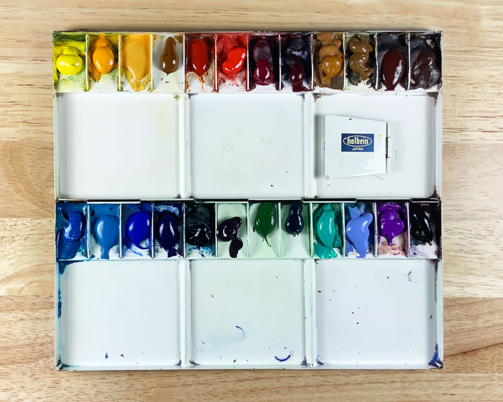
The colours I filled it with are somewhat different from my small sketching palette. New additions from my trip to Provence are Lavender, Naples Yellow and Cobalt Green, all opaque colours that are fun to play with.
Top row: Azo Yellow, New Gamboge, Naples Yellow, Quinacridone Gold, Transparent Orange, Cadmium Red Deep, Quinacridone Rose, Permanent Alizarin Crimson, Raw Sienna, Raw Umber, Burnt Sienna, Burnt Umber.
Bottom Row: Manganese Blue, Cerulean Blue, Cobalt Blue, Ultramarine Blue, Prussian Blue, Indanthrene Blue, Sap Green, Phthalo Green, Cobalt Green, Lavender, Cobalt Violet Light, Carbazole Violet.
If you are interested in knowing the brands, the tubes are below, photographed in the same order as the placement in the palette.

On the updated Art Materials page, you’ll also find my travel sketching palette and colours, my travel brushes, my studio brushes and my favourite drawing supplies, including links to suppliers when available.


What is the beautiful clear blue you use to paint snow shadows? Is it just cobalt or a mixture?
LikeLike
Donna, it’s Cobalt mixed with Cerulean and a tiny dab of Alizarin.
LikeLike
Thanks for all the information today. It keeps me thinking and planning!
LikeLike
So happy it was helpful Sue!
LikeLike
I’ve admired the Holbein palette. My hesitation is the way one side of pigments is upside down when it’s closed. Do you find that to be a problem?
LikeLike
Marian, I never find it a problem. I guess I let the paints dry long enough before going out so they never move around on the palette.
LikeLike
It is always fun to see other people’s palettes and choices of color.
LikeLike
I think everyone likes to see what colours other sketchers choose. Not sure why, but I love it too.
LikeLike
Hilarious! And informative, of course. I’m off to get a dose of Kondo.
LikeLike
I’m glad you found it funny. You would have found it even funnier to see me at my desk organizing all the papers.
LikeLiked by 1 person
Pretty excited that one of my palettes looks a bit like this one..:)
LikeLike
That’s funny Monique. Do you have the same colours or the same metal palette as one of these?
LikeLike
I must admit I find supplies more difficult to find here:( Do you order directly for the Rosemary Brushes? I love a Princeton Select pointed filbert and can’t find one anywhere here..Hmm..I did find my favorite Global Art Travel watercolor handbook at our Amazon though:)
LikeLike
Monique, I usually buy brushes when I go to the Urban Sketchers Symposia. They have all the vendors there so I buy directly. I also buy some directly from Rosemary and also from Jackson’s in the UK. Or of course in Montreal at Avenue des Arts.
LikeLike
Thanks for this information, so happy to have found you! Also, I already have your book! Great read.
LikeLiked by 1 person
Thanks. Not sure where you found the book since it has not been printed yet.
LikeLiked by 1 person
Sorry, should have looked. It was The Urban Sketching handbook by Stephanie Bower
LikeLike
No worries. I was wondering if no one told me it had come out yet. Should be out in April. And Stephanie’s book is wonderful! Glad you have it. I love it too.
LikeLiked by 1 person
Look forward to it! Also just checking out your online course through bluprint. Very cool. I recently took a similar painting course with Herman Pekel in Oregon, it was eye opening ! Best , Al
LikeLike
Nice color selection and I too have a Holbein, one very similar. It’s a beautiful palette.
LikeLike
It sure is. There are many different ones but this one seems perfect for me.
LikeLiked by 1 person
Chere Shari
I admire your work so much, I’ve been a student of yours on Craftsy and can’t wait for your book I will finally learn how you make those fantastic colors…
I just bought a metal palette myself, waiting for it in the mail. It’s a smaller version than the one you’re using, I chose the smaller version because it has a full-length flat mixing area which I’m craving for.
Anyway, merci beaucoup for sharing your know-how with us and I look forward to meeting one day maybe in one of your workshops….
A la prochaine,
Daniel
LikeLike
hi Dan. Thanks so much for writing and also for taking the Craftsy classes.
I think you are going to like your metal palette, especially if you have a big mixing area. My little one broke recently (at the hinges) but I will keep fixing it because it’s just the right size for me. Hope to meet you one day in a workshop.
LikeLike
I’m obsessed with the tidying up show! Feels good to organized the art supplies!
LikeLike
I find exploring other people’s palettes fascinating. What different uses do you give your burnt sienna, raw umber, and burnt umber? They vary so widely from one manufacturer to the other…
Lately I’ve become confused about yellow ochre and quinacridone gold. How do you use each one? Why do you not have yellow ochre in your studio palette? Do you ever use yellow ochre for the glow of the sky – do you think it would work well?
Thanks for the all around excellent blog!
LikeLike
HI Pablo. Thanks for all the good questions about colour.
Where do I begin? I guess I’ll start with Burnt Sienna. This is a colour I use so much! It is the classic complement to Ultramarine Blue to make a neutral grey, so first of all I use it for that. It also is great when very diluted to use in skin tones for people in a street scene. I also mix it with red and purple to get the right colour for Montreal bricks. We have lots of brick buildings here.
Burnt Umber is in my palette because it makes a great dark, especially when mixed with Prussian Blue. The dark it makes is very rich.
I love Raw Umber in landscapes, especially for dry foliage in spring and winter.
I use Quin Gold for making really deep greens, mixed with Ultramarine or Prussian Blue. You can’t beat the rich greens you get from that.
In skies I prefer to use Raw Sienna rather than Yellow Ochre, if I want a warm glow in the sky. I find that Raw Sienna is weaker and just dries to a nice warm colour rather than looking too yellow. But of course others may use it to great success.
I hope this was useful.
Shari
LikeLike
Phew, thanks so much for the detailed answer. I re-read my post and I did ask a ton of questions didn’t I… isn’t color fun!
What brand is your Raw Umber? I can’t make it out from the picture.
LikeLike