Limited palette experiments
Posted: May 29, 2019 Filed under: Uncategorized 32 CommentsIf you’re up for a challenge and enjoy experimenting with colour, here’s an idea for a rainy day. Try painting the same scene several times with different triads of colour. The experiments below are ones that I prepared for my workshop this weekend at the Chicago Sketch Seminar. My palette is filled with 12 Daniel Smith Colours that I’ll be using for my session titled Bare Bones: Working with Limited Palettes in Watercolour. For these experiments I worked in a Hahnemuhle Zigzag Accordion book, so that I could have all the samples on a single surface.

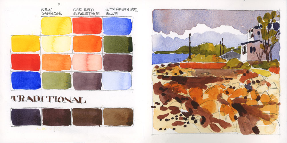
I was pretty methodical about the process, first painting each triad of colour as swatches first, and you might have seen a preview of this a few days ago. After painting all the swatches I did a pencil sketch of a little scene from Kamouraska, Quebec, from a photo I took a few years ago. I chose the scene because it had sky, water, rocks, trees and a house, which gave me lots of opportunity for colour. When the pencil sketch was done, I painted the scene using only the three colours from the swatches on the left.
Although it started to get tedious by the sixth or seventh combination, it was really interesting to see them all side by side. If you check out my Instagram feed you can also see a video of one side of the book.

The combinations are titled so I can keep track of them, although they were hard to name since some are quite similar, like the Bright one and the Bold one. At the bottom of the swatch page, you can also see the beautiful neutrals and darks that you can create by mixing all three pigments together.

The Traditional palette gave me some unexpected results. I incorporated pure red into the sketch, and loved the way it contrasted with the cool greys in the sky. The name for this one comes from an article about limited palettes by Nita Leland in Watercolor Artist magazine from a few years back.
The Art History palette got its name from a similar palette in the Adobe Illustrator colour library. After years of teaching this software to my college students, these names are hard to forget.

The Opaque palette is one I love to use on cloudy or misty days to create atmosphere. With this combination it’s hard to create deep darks but the greys are luminous.

Sometimes the name doesn’t quite match the sketch. The Muted palette swatches are quite soft looking but the painted sketch is much bolder.

The Warm palette is made up of a warm yellow, a cool red and a green instead of a blue. This is one that I have never tried before but I will certainly be experimenting with it again.

As you can see from comparing all of these, using a limited palette often creates a harmonious combination of colours. Sometimes these colours are not what you might see in the scene in front of you, but they make for a more chromatically unified sketch or painting. I learned a lot from creating these samples and I know I’ll have a good time incorporating some of these combos into my sketches.
I hope this has given you some new ideas for your own sketches, and if you want to tell me about your favourite triad of colours, I’d love to hear.


Hello Shari,
This is a wonderful complement to Key IV of your book! Thank you for sharing.
LikeLike
Minerva, you are paying attention! Thanks for reading.
LikeLike
Very interesting experiments with different color palettes.
LikeLike
Glad you like them Shawn. Thanks for letting me know.
LikeLike
This sounds like it will be a great workshop!
LikeLike
I sure hope so Joan!
LikeLike
Very useful, Shari. Thanks for your forever generous spirit at sharing information …
LikeLike
Glad you like it Gia. I was hoping readers might find it useful.
LikeLike
How beautiful and wonderful I didn’t know the difference it could make. These triads, what you have done ,gave me butterflies in my stomache. Thank you for showing.
LikeLike
Stephanie, that is such a nice thing to say. Much appreciated.
LikeLike
I have noted this post for future reference… an addendum to your great book!
– Tina
LikeLike
Thanks Tina!
LikeLike
wonderful exhibition of the concept of limited palette. thank you
LikeLike
Thanks Tylara. I will bring the book to Amersfoort with me.
LikeLike
Cool idea, I like it! It’s very ‘Monet with his haystacks’
LikeLike
Glad you like it!
LikeLike
This is fantastic. I have an accordion book I’ve never used and I am anxious to try this. Thank you so much for this detailed post. It is a great addition to your book.
LikeLike
You have exactly the right book for this Judy. Have fun!
LikeLike
I often use Cad Yellow, Ultra Marine Blue and Perm Aliz Crimson. I guess that means I like the bright and bold. 🙂 I sort of giggled when I first started reading this when you said your limited palette was 12 colors. I think this is a great experiment. One I will be trying too. I enjoy making my own sketchbooks and I made an accordion one some time ago. I didn’t ever know what to put in it. Now I know.
LikeLike
Well, I guess my palette is not limited, but my sketches use a limited palette. Clarification needed for sure, and you are not the first person the mention this. I like your triad as well, but I don’t have Cad Yellow on my palette right now.
LikeLike
Super experiments– great post. Thanks Shari. I’m experimenting with and reading more about color lately– it’s a great part of the watercolor journey. Thanks for sharing!
LikeLike
Thanks for letting me know Jean. It was very useful for me but glad you like it too.
LikeLike
This is such a good lesson. I’ve done this with four colors. While it can feel repetitive the final results really show how the atmosphere of the scene can be created by your choice of colors. I appreciate all the time you put into this in order to share it with all of us. Thank you.
LikeLike
Yes, you’re right about that Donna. The scene really changes depending on the colours. Thanks for writing!
LikeLike
Love this post! I’m still playing with sketches from Fredericksburg:) I will have to give this a try with one of my reference photos!
LikeLike
Hi Denise. Great to hear from you and glad that you’re still working on the Fredericksburg stuff. I think you’ll like this exercise, if you have a chance to try it.
LikeLike
I can’t wait to try this. I am using your 12-color palette for this year’s 30×30 direct watercolor challenge. I watched your Instagram video over and over again to write down all the palettes before I thought to check the blog 🙂 Thanks for sharing!
LikeLike
Cora, I’m so glad it was useful!
LikeLike
Have a fantastic weekend in Chicago, Shari. What a fabulous workshop!
LikeLike
Reblogged this on The Reluctant Poet.
LikeLike
What paint tray is that. I just bought Daniel Smith tubes and have been searching for tray I look. This one with 12 colors looks like exactly what I have been looking for.
LikeLike
Hi Dawnie. That is the Portable painter palette: https://www.portablepainter.com
LikeLike