Liatris
Posted: August 10, 2019 Filed under: Uncategorized 11 CommentsI’m nearing the end of experimenting with my little palette of Sennelier pan watercolours. Today’s quick sketch used mostly Sap Green, which is a colour I had removed from my palette recently. I had been using the Winsor & Newton version, which I found a little too bright and quite flat, but I have to admit that I connected more with this Sennelier version. It veers a little more towards olive, and is quite beautiful when mixed with the French Ultramarine Blue that’s also included in the set. As for the violet, that’s mostly pure Cobalt Violet Light (Shinhan PWC), straight from the tube.

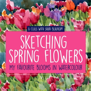










Very, very pretty. Still begging you to do a course on painting flowers. In your spare time, of course. Ha.
LikeLike
Shari–I really enjoy how you mix colors to get specifically what you want. Blue and green….I am not even there to think of blending those colors. I learn so much from you!
LikeLike
This one is a beauty….but then I feel that way about all your work. The green is perfect with the violet. It is like eye candy. I’ll have to try out the Sennlier paints myself. Your work is beautiful.
LikeLike
Thank you for sharing. I love your flowers and try to study them but mine still have a long way to go!!!!
LikeLike
And thank you for writing Laurie!
LikeLike
Good Morning dear Shari,
Very pleasant to look at, that too in the morning.
Excellent work and good color combo..
Blessings
Uma
LikeLike
Excellent …
Regards
LikeLike
Excellent …
Regards
Mark de Zabaleta
LikeLike
I swapped out my Windsor and Newton sap green for Daniel Smith sap green several months ago and I’ve been quite happy with it. DS is more golden, WN more blue. I was very surprised by how different the formulas are for these greens of the same name. Lovely painting of liatris; especially like the freshness of your brush strokes.
LikeLike
Excellent
LikeLike
Many thanks!
LikeLike