Blue clothesline again
Posted: April 29, 2015 Filed under: Uncategorized 17 CommentsI thought it might be worth trying to paint this scene again to work out some of the problems with the previous painting. Last night I found a quarter sheet of Fabriano 300lb paper and I attacked this again, this time with no drawing, straight to paint, trying to get to what I wanted as directly as possible. Instead of having two parallel trees in the background I changed it to one bigger one and placed a smaller one further back. I simplified the shapes of the foliage, made the deep dark areas a better shape, broke up the big white space with some stronger shadows and then left it alone.
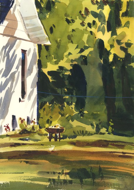











That’s a good exercise. I like the overall result… prefer the building treatment today with the shadows but I like the trees & foliage more on yesterdays. Looking forward to #3.
LikeLike
If only they were the same format I could make of collage but this one is about 1/4 of the size.
LikeLike
Forget the collage… do #3… you need a bit more practice. : )
LikeLiked by 1 person
This one lost its charm for me. I’ll take #1 anytime! But keep doing it until YOU are satisfied!
LikeLike
Thanks Dee. It’s really funny to read all the comments. I guess I am outnumbered.
LikeLike
I agree with Ross, trees from first one, building from second one or just the #1 trees.
LikeLike
Thanks Jane. I will keep replying the same to everyone. I am outnumbered!
LikeLike
Have to say I loved the first one – I was drawn to the same intense blue as the line appearing in the shrub shadow base just right of the wheelbarrow stand. It reminded me of that zinging one vibrant brushstroke touch of John Singer Sargent paintings.
LikeLike
Thanks for writing Lynn. If you have read the other comments you will see that you are not alone.
LikeLike
I, too, greatly prefer the first painting–seemed much livelier–but the shadows on the house in #2 work well.
LikeLike
Thanks Barbara. You are not alone in your opinion. Everyone prefers the first one.
LikeLike
I vote for painting #1, Shari. It’s more you. …
LikeLike
thanks Bonnie. I am outnumbered!
LikeLike
I prefer the first painting too, even though I understand what you’re saying about the darks. But in the first one, the tree trunks were so interesting. Here, they recede into the shadows and the mid-green sections become the trunks, to my eye. I also prefer the softer shadows on the building and the livelier greens in the first sketch. I could feel myself standing in that scene on a sunny day.
LikeLike
Thanks Susan. I see what you are saying. I still think it was a good exercise even though I stand alone…
LikeLike
Hi Shari. I liked the 1st version too, but I think the 2nd one is more vibrant, looser and more immediate. I like the stronger shadows on the wall, less tentative. Also the blue clothesline reads better. Maybe it reads on the actual 1st painting, but is lost in the monitor screen. Is it too much overworking to scratch down to some white paper over parts of the clothesline? I don’t know. But I would ponder it. I am off to Toronto for the weekend. Talk later, Garry
Sent from my iPad
>
LikeLike
It’s not a bad idea to try that Garry. Since this is done on 300lb I could certainly try it. Have a great weekend in TO!
LikeLike