Black mast
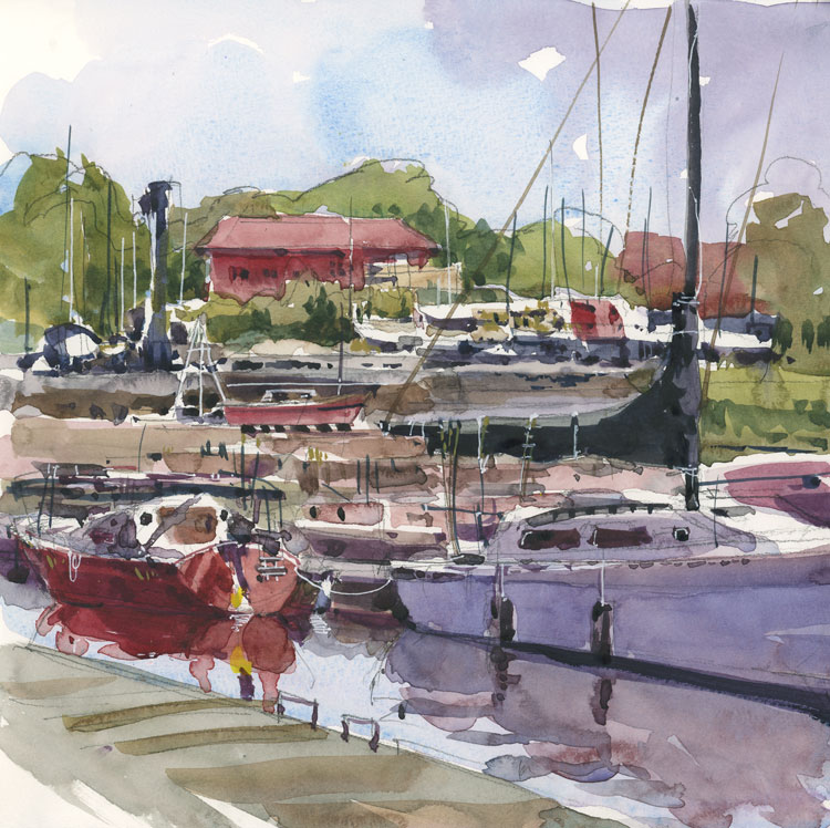
Posted: May 14, 2015 Filed under: Uncategorized 11 CommentsThis was a difficult scene to sketch and you can probably guess why. The middle ground in between the two foreground boats and the elevated boatyard further back was very confusing. In that section there’s bits of boats, some water, a rock wall and a sloping section of grass. I’m not sure how I should have clarified this in the sketch, but it doesn’t help that the main sail cover is black, creating a hole in the middle of the sketch. I will definitely have to go back there and give this one another try to see if I can make it read better. I ran out of space on the page but probably having the front of the sailboat in there would help define the space as well. Isn’t this what makes sketching fun?


I think you made a more-than-valiant effort, Shari! We can definitely tell what’s “going on” there. Good job!
LikeLike
Thanks Helen. I’m glad you commented because it lead me to discover your wonderful site and paintings. It’s nice to see your Montreal connection too!
LikeLike
Admiral Admirable ! Beautiful ~
LikeLike
Thanks so much.
LikeLike
Sorry, am I allowed to be picky? Not that I have ever asked in the past. Is the red boat sitting on higher water than the white boat… or is it just my eye? It is always difficult, when you are painting more than one boat, to make them look like they are sitting in the same plane of water… not a problem on land because we all accept that the land goes up an down.
And, you are right about the black sail… it recedes. Is there a clever way to deal with this other than changing the colour to a more suitable one?
LikeLike
It’s often after I scan my work that I see things. You saw this as being on higher water. I saw the white boat as one-dimensional. Like a paper cutout of a boat. Completely flat! And yet when I was drawing I didn’t realize it at all.
As for the black sail, I don’t really know how to solve that one. I think I would have to test this out in a value sketch…
LikeLike
Love to follow your blog, as you always comment your own sketches, and as you have a critical point of view on them.
LikeLike
So glad you found the blog and that you appreciate the commentary. It’s always a pleasure for me to read the comments.
LikeLike
I think you are right about the values. I’ve learned that its ok to have dark shapes that are closer to you and then the background fades to lighter values, less hue. I think your black sail is ok.
LikeLike
Hmm…maybe this is a case of not achieving your objective, but of achieving something else.
If I look too closely at this, I can see too much confusion. It’s had to see the scene, or how things fit together. But if I step back far enough to take it all in at once, it suddenly comes together and feels very energetic. I like the energy. That black becomes, not a hole, but a strong small counter to the masses or rusty red on the left.
In other words, it takes on a kind of Expressionist feel, and it doesn’t matter that some details don’t make sense. The painting as a whole makes sense.
LikeLike
I feel the whole mast including ‘rigging’ (?) creates a triangle that my eye is drawn to. When I try to look elsewhere I see much busyness especially in the middle ground. What I love are the reflections in the water. They are so loose and fluid. They are beautiful. I like the sky and the treeline and the shadow work on the two main boats. Sorry I don’t have a suggestion about the black mast, except that from what I have read, value sketches, as you suggest, are very helpful. I am not an artist…and you teach art!..so all above is from one who just has an opinion about art. I have tried to make it constructive feedback…this is me practising my writing and positive communication skills; I love to write. From Sandi, who enjoys your blog immensely.
LikeLike