Watching the fishmonger
Posted: June 19, 2013 Filed under: Uncategorized 7 CommentsThere’s something that happens when you hang around a vacation place for long enough. You start to differentiate the locals from the tourists. From my kitchen door I can see the back deck of the fish shop where I buy the fresh catch for my dinner. This morning I was looking around for something to sketch and I realized that there was a lot of conversation, noise and action on that deck. It wasn’t the daily onslaught of tourists eating their lobster rolls. It was the day’s delivery of fish and my favourite moment was when the fishmonger, in his bright yellow apron, leaned over the railing to catch his breath before the next delivery.

Deep and dark
Posted: June 18, 2013 Filed under: Uncategorized 34 CommentsI have many thanks to send out today. The first one goes to Mary Kay Carbone of Four Winds Pottery in Rockport who found my work online, bought some prints to sell in her shop and encouraged me to spend some time painting in Cape Ann. This is truly a special place.
Secondly, thanks to my friend Fleet Woodley who suggested I try M. Graham paints, which I am experimenting with this week and really liking for their creaminess and saturation.
Lastly, thanks to Don at Island Art and Hobby in Gloucester who carries the M. Graham paints in his shop and who suggested I visit Halibut State Park because I might like the granite quarries. You were right Don. Not only did I love the spot but I also liked reading about how the place got its name: sailing ships rounding Cape Ann would “haul about” off this point of land.

Alison Paige
Posted: June 17, 2013 Filed under: Uncategorized 27 CommentsI haven’t spent a full day sketching and painting in a really long time and after two fairly complex sketches and this painting I can barely type the letters on my phone. Suffice to say that Gloucester is my kind of town. One of America’s oldest seaports – with industrial buildings, a very busy harbour, and steeped in the history of America’s maritime painters – it is a place that could keep me sketching for a full year.

Fishing shacks
Posted: June 16, 2013 Filed under: Uncategorized 6 CommentsRockport, Massachusetts, is really pretty and pretty overwhelming all at the same time. There’s too much to sketch – the boats in the harbour, the old fisherman’s houses and the famous “Motif No. 1” building that I painted last year. As is often the case, the best views are the ones that surprise you as you turn a corner. These little shacks didn’t seem half as interesting in the morning but later in the day the light changed and there was a good shady spot between a candy store and a sunglasses shop.

Bearskin Neck
Posted: June 15, 2013 Filed under: Uncategorized 12 CommentsThe main tourist drag in Rockport, MA, is called Bearskin Neck Road. Lined with shops and restaurants on either side, it ends at a lookout point where you can watch the fishing boats go in and out of the harbour or you can simply shade your eyes and stare out to the Atlantic.

Dark corner
Posted: June 13, 2013 Filed under: Uncategorized 8 CommentsAfter much rain the gardens in Montreal are starting to look a bit overgrown. At least mine is. That’s also partly because I tend more to my sketching obsession than to my plants. This dark corner is a mosaic of light and dark greens tiles with one or two white ones thrown in.

Highway 20
Posted: June 12, 2013 Filed under: Uncategorized 8 CommentsThere was an article in the local paper about the reopening of the main street in Ste. Anne de Bellevue after a year or two of road construction, so I made my way back to a favorite spot for sketching. I have painted here many times because I like the little grouping of houses that sit in the shadow of the Highway 20 overpass. There’s still lots of work going on a little beyond where I sat but my view of the corner was good despite some short-term parking of cars and trucks in front of the white house.

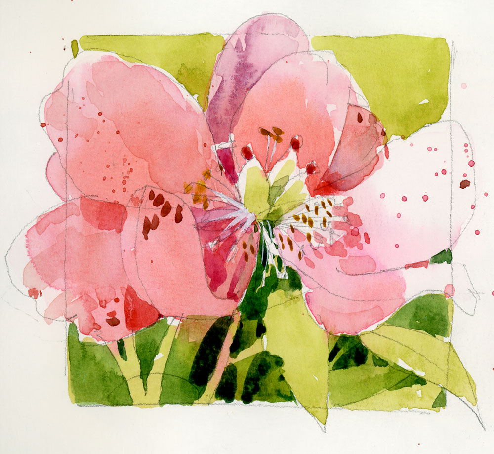
Tree peony
Posted: June 11, 2013 Filed under: Uncategorized 19 CommentsAt some point I may tire of writing about how much use I am getting out of my new hand•book travelogue watercolour sketchbooks but bear with me for a short time while I continue to extol the virtues of these journals.

I love the format. I can fill a page with notes, experiments and doodles a bit like the spread below. There’s room for dates and colour swatches, or just simple studies like the tree peony. And it’s a really nice book to hold if you are drawing while standing.
I love the paper. The quality is good enough to paint on both sides even if it is 95 lb.
I love the texture. Not too rough, not too smooth. Just right…

Testing blues
Posted: June 10, 2013 Filed under: Uncategorized 14 CommentsThinking about colour mixes is one of my favourite aspects of working with watercolour but I am not very scientific about my pigments. If what comes out of the tube looks good then I’m usually happy. But I wasn’t very satisfied last week when my French Ultramarine from Daniel Smith did not perform as promised. I’ve discovered that the proper term for what happened is flocculation — clumping together of pigment particles. In my case the paint did not mix well with alizarin crimson and I ended up with blue flecks sitting on top of a red wash. Today I did a little testing, comparing the colour to a Winsor Newton French Ultramarine and the paint was fine which leads me to conclude that a bit of the binding agent wasn’t properly mixed in. This is a colour that I am using in my workshop in Barcelona and I want no surprises when I am there.
I also tried out a few new colours today: a cinereous blue from Sennelier which came to me as a sample when I purchased a brush, and a brown madder and a rose of ultramarine donated by students. I love the cinereous blue. It’s a bit more electric than cerulean but as you can see I didn’t do a good job of turning it into a grass-green. It looked fine on the palette but on the page it’s scarily artificial. I probably should have save the test for a bit of sky instead.

I’m lovin’ it
Posted: June 9, 2013 Filed under: Uncategorized 22 CommentsPart two of trying out the hand•book watercolour journal is testing it out with pencil and really juicy washes. You can tell I used lots of water because of the backruns but the paper is performing really well. And I love the bigger format. With this new size I have a chance to draw a little frame around my sketches and not have to paint to the edge of the paper like in the 8.5″ x 5.5″ size. These books are definitely going with me to Barcelona!


